Initially, I didn’t know what I wanted to create my page around so I figured I’d see what I could do with each page for starters.

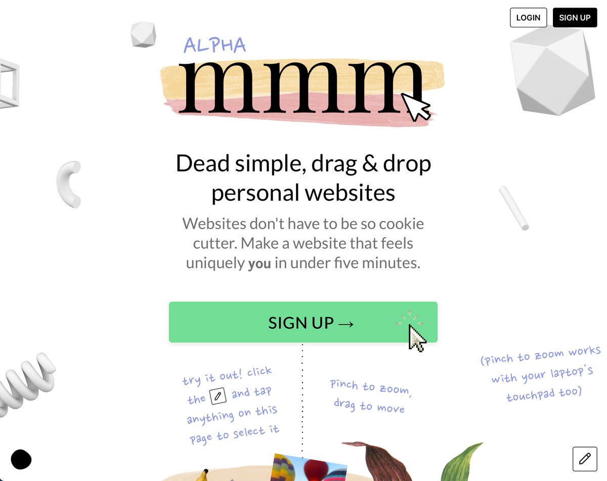
I began working with the mmm. page and instantly found its ease of use and interaction with your page pretty addicting. It didn’t take too long to figure out how to edit the page so I explored.

For some reason, I thought about a prior conversation about vintage and underrated cars and decided to make my page a showroom. First off, I named my page midnightclub.mmm.page after one of my favorite racing games.
From there I found a backdrop of a showroom and “filled” it with a collection of some of my personal favorites from vintage to more modern. I also added a hyperlink to some of the best/most anticipated cars coming out this and next year in the “top cars for 2023” area.

After messing with mmm for a while I checked out Figma. This was the opposite experience from mmm as it’s very confusing on how to even get started. I’m sure there’s a lot there but, the way it’s structured makes it hard to maneuver through the site.


Nice work on the mmm.page collage!
Looks great, keep pushing on this piece, you can add so much more context to this post with images and videos for sure – so much out there to share!
Great job! Love that you detailed your experience with the website.