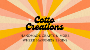
Once I picked my domain name cotton creations I knew I would have to start thinking of how I would like my website to look. I decided on making it cohesive to the Instagram that I am also working on simultaneously which ended up working out really well. I had already created a logo for my business which is what I’m going to use to be the model for my website.

I will be including a few different pages. I will have a home page, gallery page, and BTS page, as well as my blog page which would serve as information for my restocks and new releases. My home page is going to serve as my about page which will give all the information on how I started my business and why and what we’re all about. My color scheme is more on the pastel 70s side. I have always been told I was born in the wrong era or I have an old soul because my style and personality are pure 70s.
The first thing I worked on was my header. I decided to keep the background simple and stick with white because I’m to use the colors in my logo to great accents with the words and the layout. The bolder the background the more difficult it is to keep everything cohesive and harder to find a font and word color scheme that would fit.


