The WordPress Customizing Series, Part 1! Assignment 10
Welcome to an instructional website that guides web builders who specifically want to target a wellness audience.
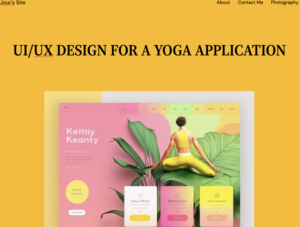
The purpose of the App is to target and service viewers and members that are interested in building their own followers in the yoga and wellness community.
Creating a layout with typography, font, and background color while following Tuesday’s tutorial by Professor Seslow went through many colorful ranges.

First, mandarin orange with white text.

Then lime green with black text.

I tested all these combinations and felt orange with black text strained my eyesight the least.
The youtube.com video above is a short tutorial to help organize your website and add images to your WordPress gallery.
Click the following link to view Jour’s WP website and gallery:


Excellent work on this!
Love how the site is coming along and seeing the process on how you are testing, tinkering and making decisions here!
The process is all about contrast and experimentation, creativity is endless with WordPress!
Keep going!