After reviewing some of my classmates’ websites, I got a good look at how creative they all are. Some of them gave me a lot of inspiration regarding the design of my website, what kind of artwork or photos to use, or even how to format my own website.
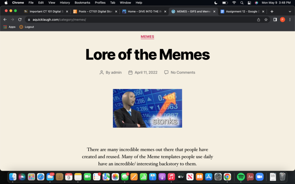
I particularly looked at Stella’s website: https://aquicklaugh.com/ and Duojay’s website: https://madeinyourlikeness.com/home/. Stella’s website is a place to go for a laugh. She has a good structure for the different gifs; very organized, and clean looking. The content itself was clear and fun to read. Overall, easy on the eyes, which I like but also very creative and fun material. My favorite post was Lore of the Memes.

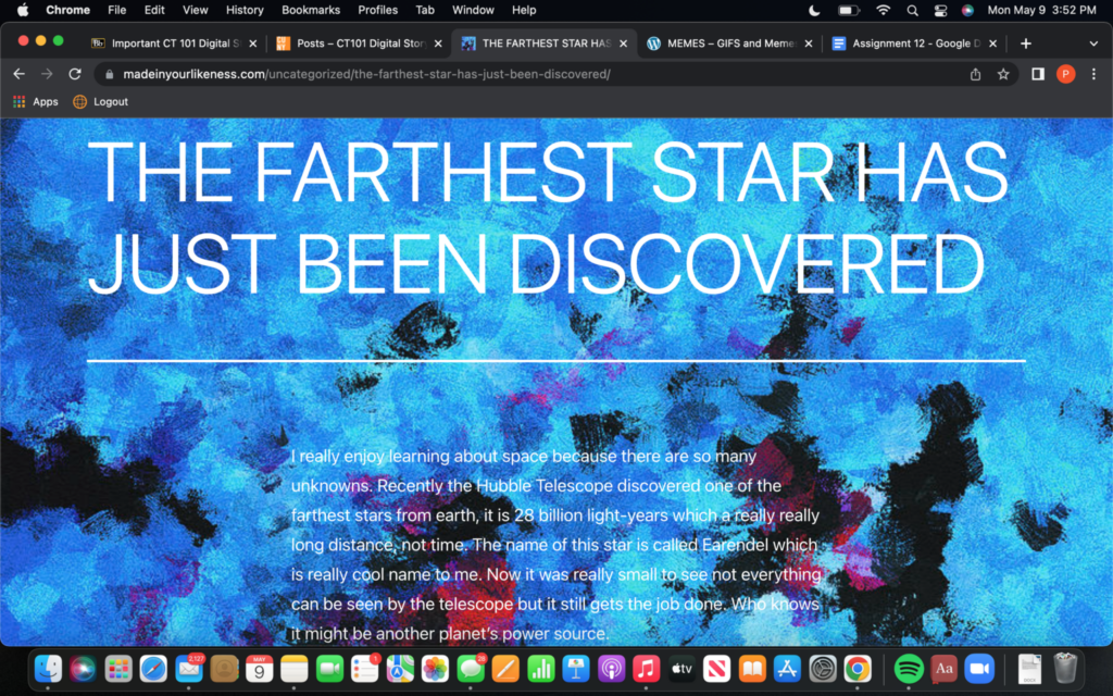
Duojay’s website was a fun one to explore. I loved the artwork in the background; it really looks like an artist’s website. Simple and easy to navigate as well. There’s also great and interesting content. I specifically enjoyed reading, “The Farthest Star Has Just Been Discovered.” I’m looking forward to revisiting and seeing what more I can learn from it.

The third website I looked at was Niko’s: https://nikobalkaran.com/. Niko’s website is really business professional. Pleasing on the eyes, and looks very organized. He also has a great layout. I hope to do something similar to my own website.

Overall, everyone has been doing a great job and I’m looking forward to more blog posts and reviewing the critiques of my own!


