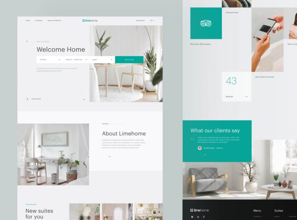
I think a core inspiration or more like an overpowering influence when creating this site was modern websites. I think the internet in general has become a clean, utilitarian, corporate space.

A lot of sites are about professionalism and a minimalistic futuristic design at the cost of personality.

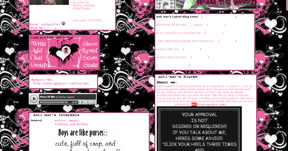
In the 1990s and 2000s when the internet was rising in popularity a lot of sites were not like that. They were fun, expressive, and had goofy, hyper-stimulating backgrounds.

Even social media sites like myspace and even youtube had customizable backgrounds and themes for your page.
In retrospect sometimes these designs can come off as hyperstimulating and cringy but despite that, all of them now seem simultaneously nostalgic and even refreshing compared to the white or black modern minimalist space.
And so when designing my own personal site it was difficult to put together a site with so much personality when you so well adapted to making monotonous, utilitarian websites that serve a purpose rather than convey a personality.
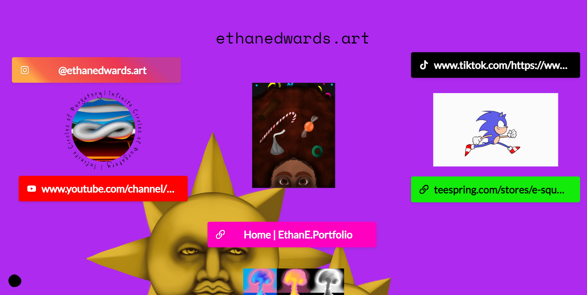
A lot of this mixed in with my own dry and cynical persona to make a site trying to have personality but ultimately failing. I only thought about making a portfolio site, a liminal site serving as a gateway to my artwork and social media sites while also adding a puzzle-like aspect to my work.

I made three pages within my site. The first was the main page, the second was a slightly cryptic about me section and the third was a synopsis of a character I made.
There are also links to a song, my webcomics, my social media platforms, and my portfolio. Overall I think I did a pretty decent job but hopefully, I can squeeze out more creativity from my neurons and add more things to the website.
I challenge everyone to explore the site and find as much as you can.


