The time has come to start customizing my website. The journey begins!

So far, it’s been challenging trying to figure out the direction I want for this website. In class we already posted a blog post on the website and played around with tools such as the widgets, plugins, and themes.
Honestly, even though we’ve had professor walk through some of the tools, after class, I was completely lost. I tend to get severely overwhelmed when learning new software. It’s like my brain completely shuts down.

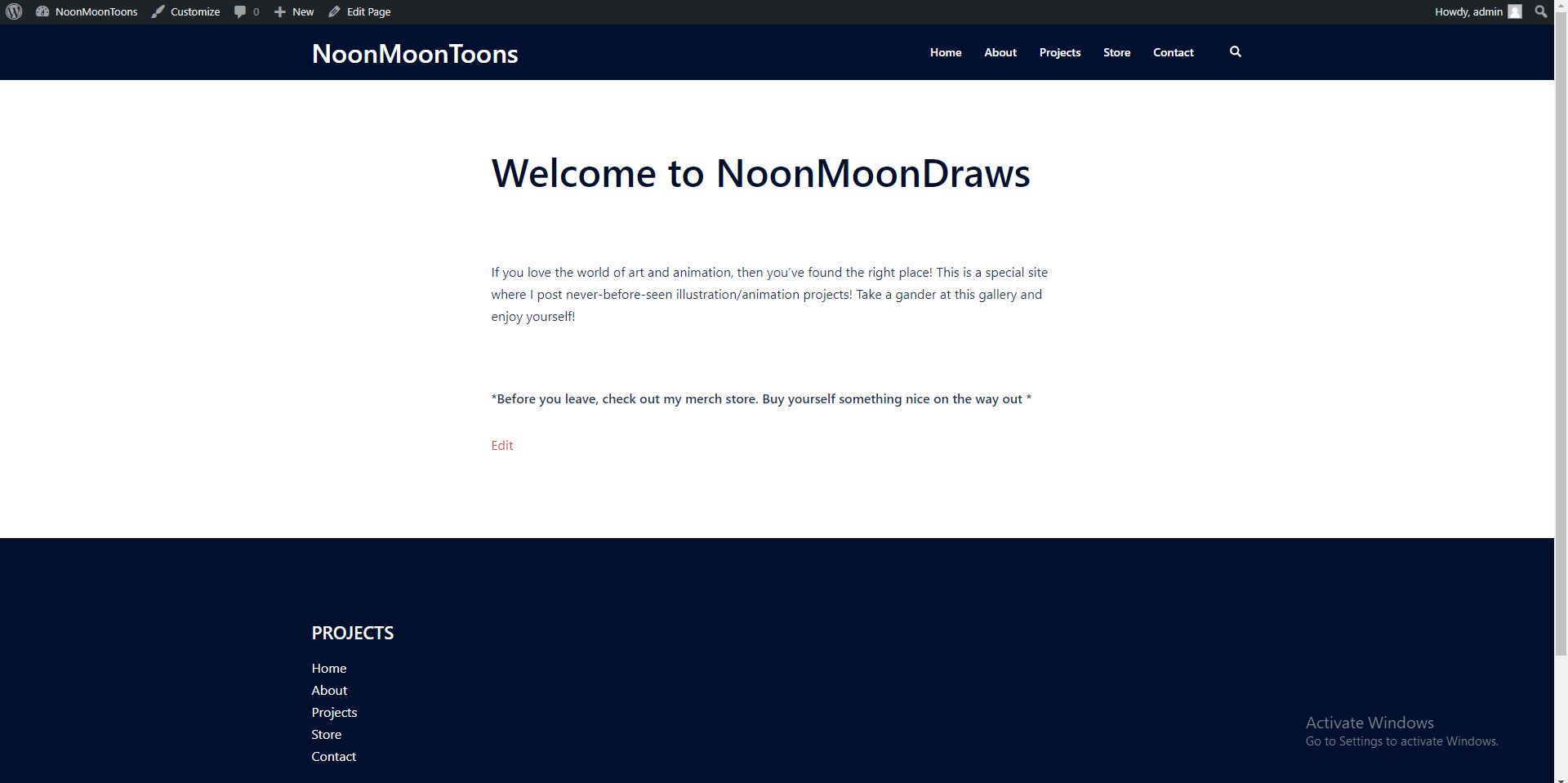
To start off simple, I changed the default theme of “Twenty Twenty-One” to “Sydney.” To add, I really like the number of free options that’s offered to customize a unique website. Just changing the theme, alone, has spruced up my website. I even made an introductory message on he homepage.
Take a looksie.
I also swapped and changed some of the page links. I switched some of the default links to titles like “Projects” and “Store.” The projects page is to present my art to view and the store page is a link to my merch store.


