Wassup everyone!!!!!!
Alright let’s start this, so for this new assignment, I just checked around the site to see what I want to do. Hmmm, what did I do you wonder? Frankly….. I was asking that for a good week.
I know I know what can I say. I’m a bit nondecisive.
I finally found what I wanted to do. WOOOOOOO

I found this challenge and it clicked with me for some reason. Then I found out why, I haven’t done design for years only digital art so might as well get back into it.

Step 1: find a photo

Step 2: Edit the photo to your liking. Honestly, I didnt want the light to be red so I made it pink for fun and played around with the lighting
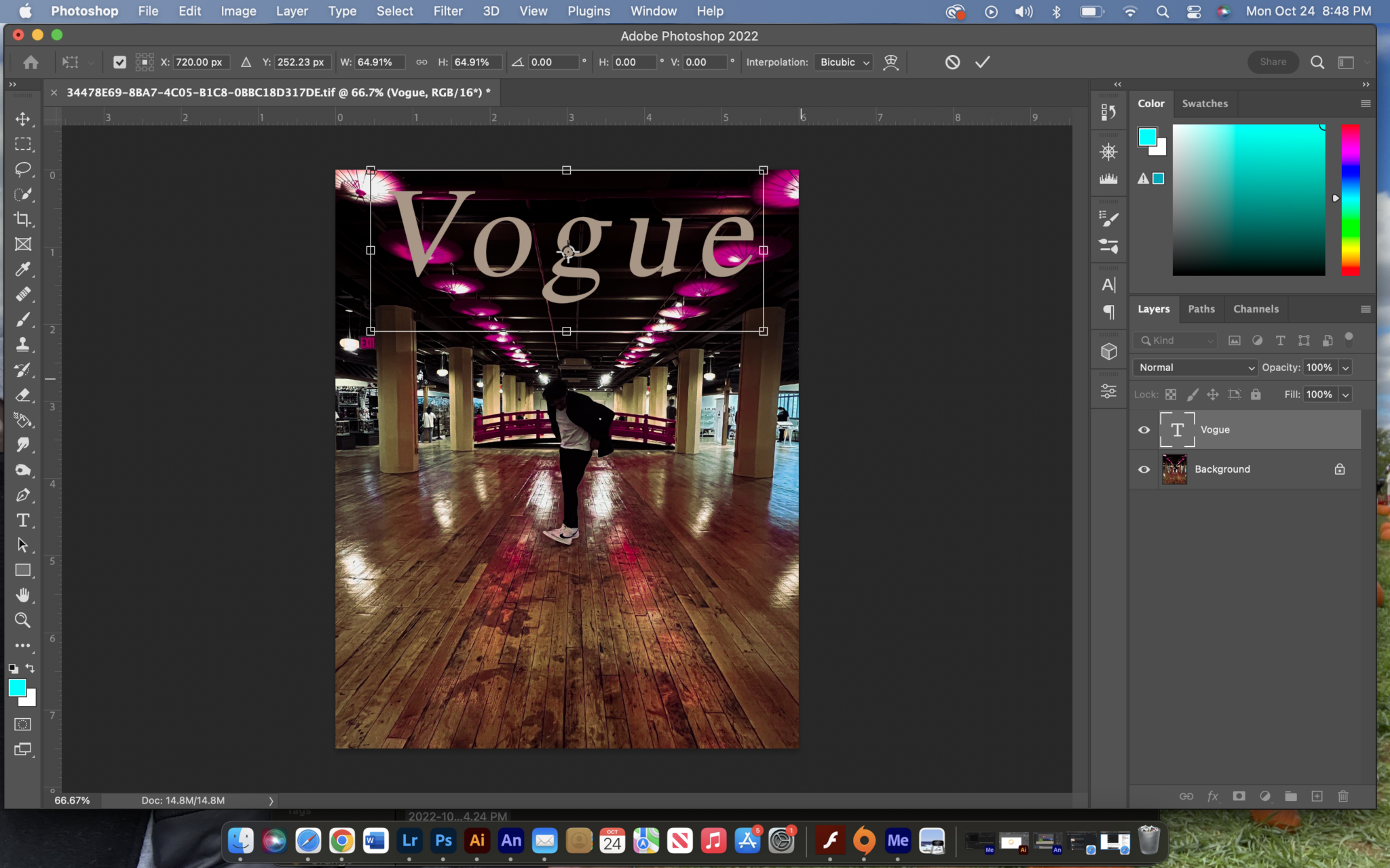
Step 3: I went to photoshop and just added the name, usually, Vogue would have multiple texts on their covers but there are some that are simple. that’s what I did
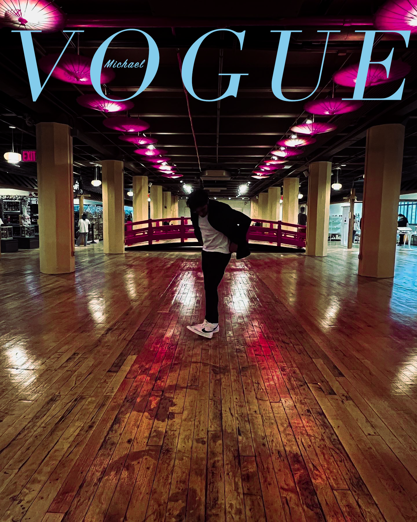
Finally, I wanted to use the colors from the picture and the blue was the most standing and TA-DAAAAAAAA
Well, that first assignment because personally I felt like I didn’t try enough on this and looked around to do another project until I found one. This one was cool, to be honest.


So honestly it was the same steps as the first project but towards the end, I decided to make it more SPECIAL.

And BOOM This is the final work. I really enjoyed this one more and I kept it with two colors to blend well with the aesthetic. This honestly made me want to continue with typography and I’m going to do better.
Well until next time guys!!

This entry is licensed under a Creative Commons Attribution-NonCommercial-ShareAlike 4.0 International license.
hello,
i love how you’ve incorporated your passion in this assignment. i can see the passion. keep up the good work!
Well done here!
2 great selections to work on! These are both executed really well!
Thank you for the tutorials and process explanations!
The image sequences help the reader get a great understanding of the process!
thank you!!!
I wanted to show my progress since I enjoyed this.