

I was indecisive when it came to choosing a background color for my wordpress. I was stuck between a light blue color or a darker royal blue. I opted to go with the lighter option so that my font color remains black. To me, a darker font stands out more on a lighter background than a lighter font on a dark background.

This is the color I chose. I decided to just include my name and the class’ name to make it unique and simple. It states that it is my website for CT101 but it does not limit what I will post.
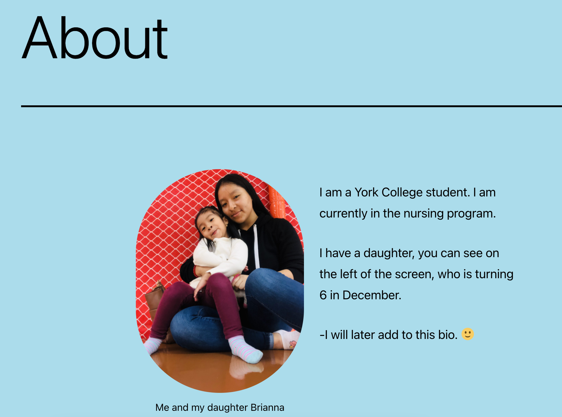
I decided to add a little bit about myself on the website. I included what I am majoring in, my favorite person, and I added a picture of us. This part was fun and tricky because I still did not know what exactly an audience would want to know about me. I am shy so I did not know what I wanted to share.
I think I will post a variety of things. I would want to include pictures of different foods I enjoy, different places I would love to visit, my journey in my education and major. I would also like to include different “coffees” I have tried. I put it in quotes because some people may argue that starbucks coffee is more creamer than actual coffee.

This entry is licensed under a Creative Commons Attribution-NonCommercial-ShareAlike 4.0 International license.
Excellent, I like the color and contrast choice.
The dark text on the lighter background is easy to see and my eye travels around easily to find the navigation. We always have to keep in mind that we are designing our site’s for everyone that is not us.. so we always need to consider who is on the other end and have we made things accessible and easy for them?
Great work!