After browsing through the DS106 Assignment Repository, I finally decided on 2 projects that I want to try my hands on.

The projects I’ve chosen are “City Graphic Poster” by Emma Cate Neves and “Create A Silly Movie Poster” by Richard Barnes. Both projects struck my interest in tackling a unique spin on Graphic Design.
“City Graphic Poster” by Emma Cate Neves

“Create A Silly Movie Poster” by Richard Barnes
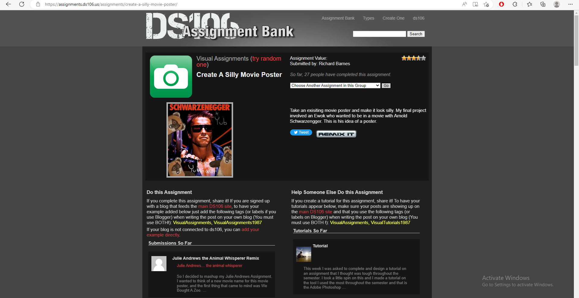
Out of the 2 projects, I’m gonna work on the city poster. Looking at the movie poster project, it feels like something that I can do due to the simplicity of it. It seems like you can simply Photoshop random elements to a famous movie poster. While with the city poster, I feel challenged to push my creativity at a professional level.

For the “City Graphic Poster Assignment,” the goal is to take an existing photograph of any kind of infrastructure and turn it into a whimsical poster by the use of your creative edits.
This is the original picture I used.

And here’s the finish product:

Here’s how I did it!
I first got a pic I took, myself. It’s from my Photo II class last semester. I sifted through a bunch of photos until I reached one, I wanted to work on. Instead if using Photoshop, I used ClipStudioPaint, instead. It works just as good! I first started by importing the original photo.

I then used the lasso tool as much as I on the sky b/c that was my focus. I wanted to make a dream-like world where the sky was more of a pinkish purple than a regular blue. After lassoing the parts I needed, I made a layer above the image and set the layer to Add (Glow) I also applied this technique to the water.
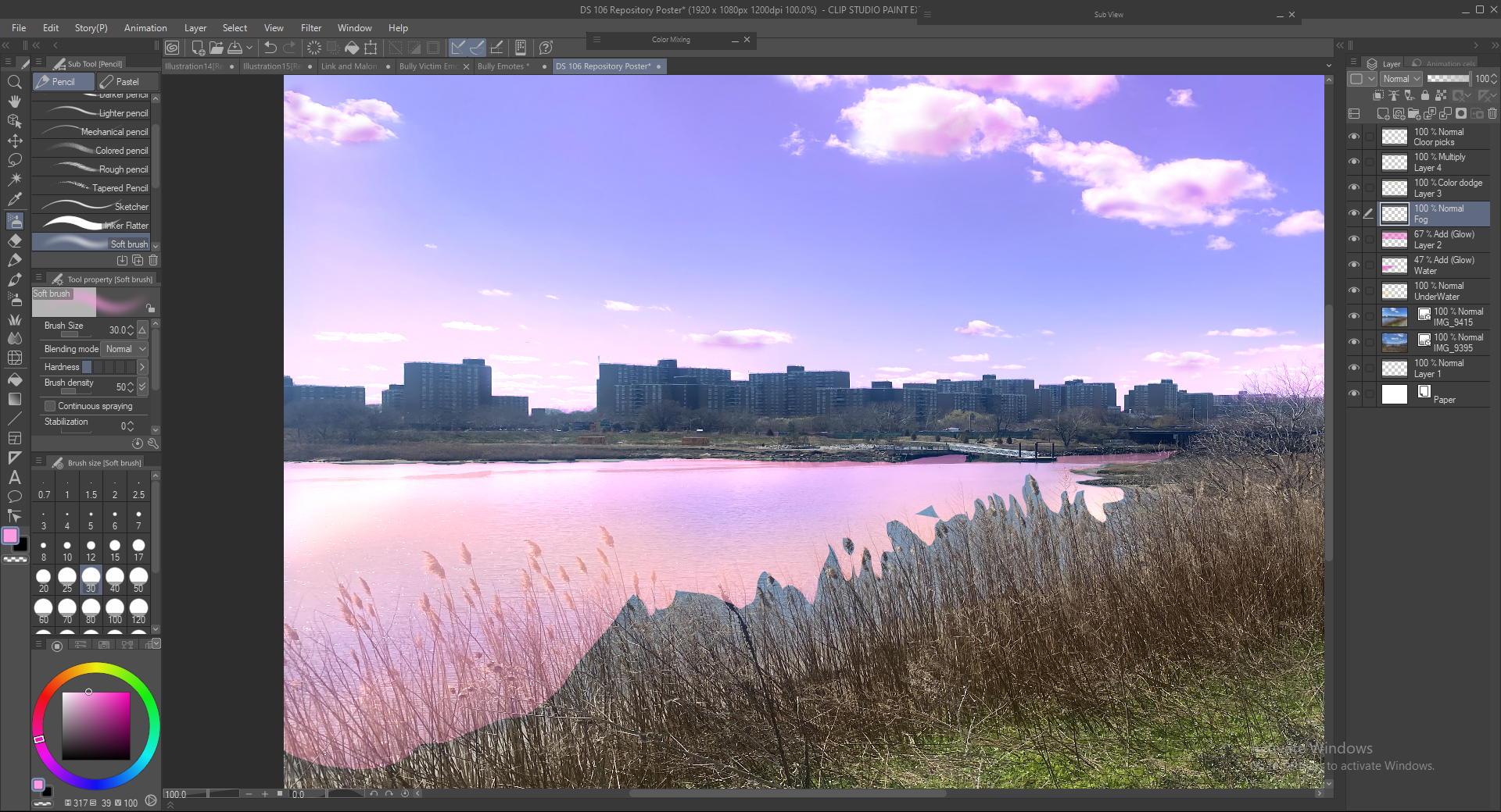
My next obstacle was the choppy edges, due to the wheat. I wasn’t going to lasso all around the wheat, because it would take me too much time. So I then decided to add fog to play into the dream-like world. I made another layer above everything, used white and the airbrush, and set the layer to Vivid light to cover up the hard edges. I also applied it to the buildings to soften the edges due to bright light.
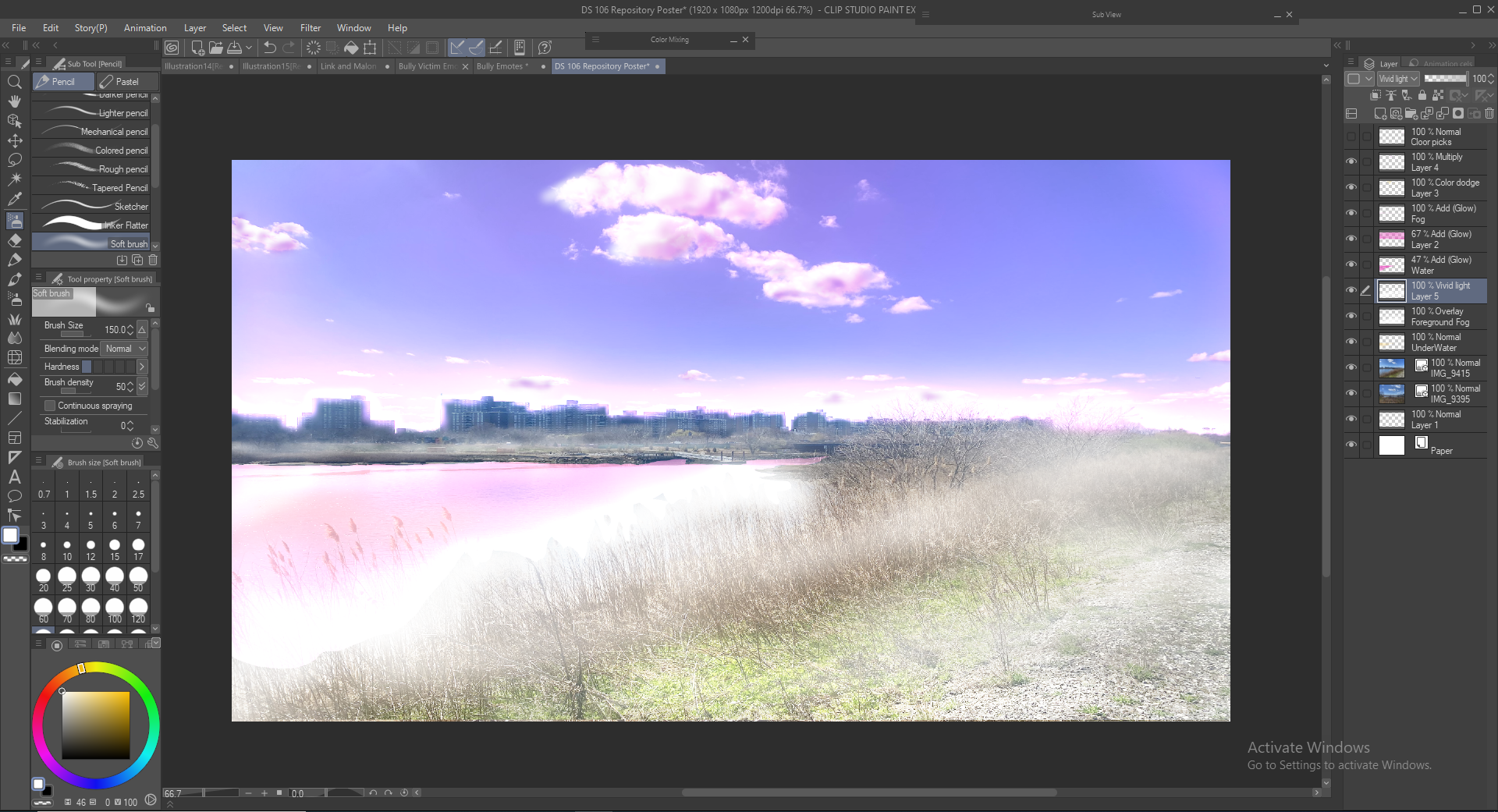
I almost forgot that this needed to be a poster, so I used the rectangle selection tool to crop out which section I wanted to use as the poster.
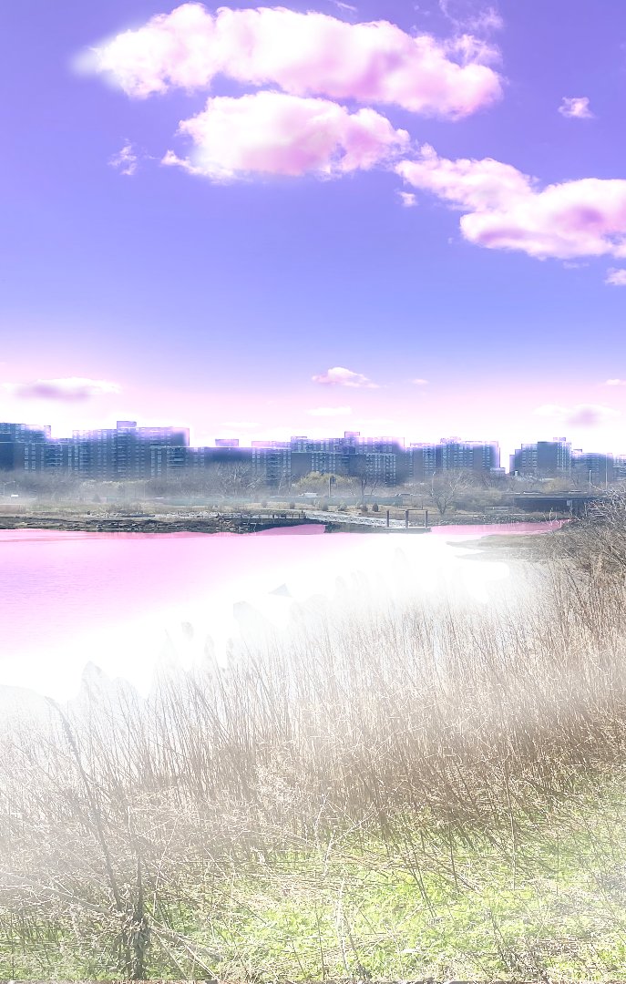
Next, made another layer above everything, used the Calbri font and typed out NEW YORK to the size and color I wanted. I then used the magic want tool to make a selection. I lastly used the airbrush tool to lightly erase the lettering to my liking. And that’s how we got to the final product.
I hope you like it!
In the end, I like ho this turned out. I am not used to doing re-touch work at all. My forte is more on the character illustration side. However, doing this assignment made me realize how much more I’m capable of when I put my mind to it.

I should definitely be doing more of these types of projects. It’s important for me to expand repertoire in my craft. It wasn’t really a difficult process because I am very used to using the tools in ClipStudioPaint/Photoshop. It’s more so I’ not used to using the tools in the way I did for this assignment. This experience will help me break out of that shell to do more of these projects!

This entry is licensed under a Creative Commons Attribution-NonCommercial-ShareAlike 4.0 International license.