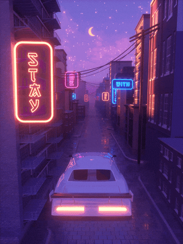
Today I explored the world of Vaporwave and I can honestly say I was extremely amazed. one common trend that I noticed amongst all of the visuals was the similarities in colors. Often times pink, purple, and blueish colors are used to give the viewer a vibrant contrast.
From a Journalist’s point of view, I would be able to write a novels based on what I see. Being the aesthetics are a contrast of different things, time periods, cars, etc many people will enjoy looking out these visuals while telling a relatable story. The aesthetic of the ’80s makes it more fun to look at is that we are 20 years late. Honestly this is not something I would try to recreate but, I definitely do have interest in writing and analyzing it.

This entry is licensed under a Creative Commons Attribution-NonCommercial-ShareAlike 4.0 International license.