
Hey everyone so let’s have a lil review time of my classmates websites. This is a good idea because we all need feedback because there is always something we can improve on.
I started by reviewing Safiya’s website. It has a cool layout which makes me feel like I need to step up with the background. I have to find out how to do it because it looks nice. I don’t vibe with the background color but it really does make it stand out and fit with the whole overall aesthetic she made. She also does movie reviews and is open-ended allowing her to do reviews, poetry and cooking which is cool because she has a set idea of what she will focus on.


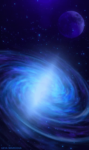
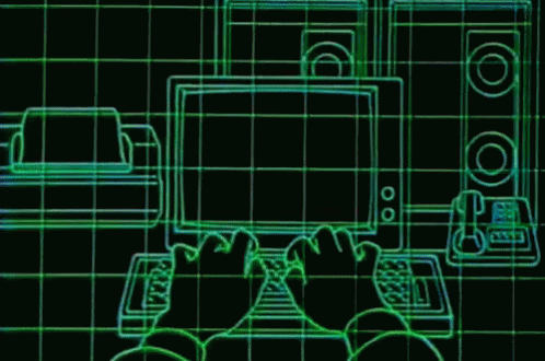
The next person I will review is Duojay’s website. The whole layout is so cool it reminds me of space and galaxies. They also added an animation which was so well made and I think it demonstrated that they like space. The bright colors really make it pop. Although I feel the white font does get a little lost but the overall brightness makes it looks so cool and it will most certainly attract viewers. I wanted to add a pic of their site but it’s not letting me. But I will show you the vibe it gives off below.
So far my classmates have done so well with their sites. I’m glad we all have learned and grown in this class that it will allow us to be better at technology.
BYE

This entry is licensed under a Creative Commons Attribution-NonCommercial-ShareAlike 4.0 International license.
I really like Duojay website too. I wrote it in my post too. It’s very unique and different. I love the animation too.
They’re really good. Can’t wait to see how they’ll make their site better.
Excellent!!!
As always! Thank you!
Thank You.
?
🙂