Assignment #9 – Midterm Reflection!

Hi everyone!

Wow, this semester is just flying by! I’m graduating at the end of December, so I’m both excited and sad to be finished with college.

I remember being so nervous at the start of this semester because this class would be completely new territory for me. I had no previous experience in website creation or web design, or even blogging.

However, Prof. Seslow was very patient with making sure that we understood everything, and I think that the class moves at a comfortable pace for beginners.

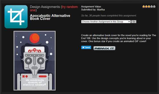
One of the highlights of this class for me has been working on the DS 106 projects. It was so much fun doing some of the creative projects there and adding my own twist to some of them too. I think it’s a good way to get out of an artistic slump because there’s so many different things to do!

I had so much fun working on the very first project I did with typography. It really helped me to expand my knowledge with Photoshop. Another highlight for me has been finding and embedding GIFs into my posts. I feel that it really adds some personality to the text!

So far, I really enjoyed learning about new things in CT 101, and can’t wait to see what’s next 🙂
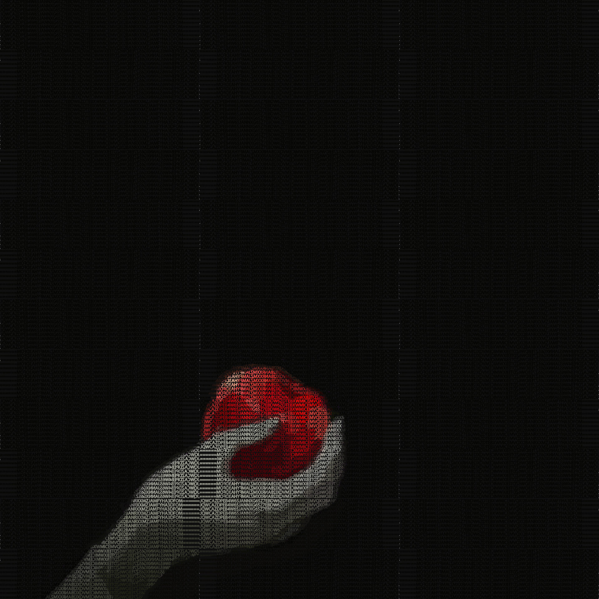
Assignment #4 – DS 106!

Hi everyone!

For my first assignment, I chose to do something with typography. I had a little intro to typography in my graphic design class and decided to try my hand at this cipher assignment because it looked pretty cool!

Cipher Typography Photo Images

Basically, you can encode any phrase that you want into a cipher, and use these alpha-numerical digits to form a picture. The final product should have two versions: one with the cipher, and one with the translated message.

For my project, I encoded my message to Base32 using Cryptii.com

As for the content, I kept using the theme of apples. You should know by now that I’m a huge anime fan, and I couldn’t think of a more perfect phrase to encode than this one:

Ver. 1 : Encoded

Ver. 2 : Decoded w/ under layer

This took me around 3+ hours to color and complete in Photoshop, but I’m pretty happy with how it came out! If you zoom in on the second image, the letters created this cool effect with the color under them. I had to make the cipher font really small because the spaces between the letters looked kind of inconsistent if they were any larger.

For my second assignment, I chose to try doing a book cover design.

Apocalyptic Alternative Book Cover

I’ve never really done any formal design projects like this, so I thought it would be interesting to try this. I hope I’ll get to learn a thing or two about what colors I should choose, what appeals to the audience etc. I think that this could go in soooo many directions: supervillains, killer robots, maybe even zombies!

Can’t wait to try it out!