The end of the semester is here. It’s crazy to think about it but we’ve all come a long way from the beginning of the semester. CT101 has been a great learning experience for me.
I enjoyed learning and developing new skills of design and blogging. I seem to have learned how to make these blog posts the most. Embedding memes, images, videos and hyperlinks into these posts. Learning it, grasping it, and becoming comfortable to where it’s super easy now. I’ve also discovered multiple sources for inspiration in design and creativity, such as Giphy, Pixabay, Photopea, etc.

Not only did I learn to use these platforms, but also create one of my own. Making a website was one of the more challenging projects for me, creatively. More so than other assignments, it gave me a lot of creative freedom to do something that’s completely up to me, with no specific guidelines. This was something I was not used to, but learned to do throughout the course of the semester. Starting off by making my blog posts definitely helped with this.
I enjoyed that this class challenged me in a way I haven’t faced before. Moving forward, my creativity is something that I’ll continue to develop and allow myself to be in all aspects of life. I’ll definitely carry it with me for a long time.
My website is something that I’d like to hold on to as well, as it’s a space that allows me to be myself and share whatever I please. I hope to maintain it a place where my creativity flows, regardless of whether it’s seen as unprofessional or not “business-y.” I want it to be a platform where I can be myself completely.

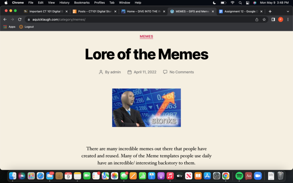
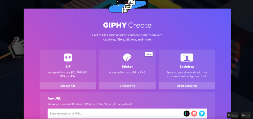
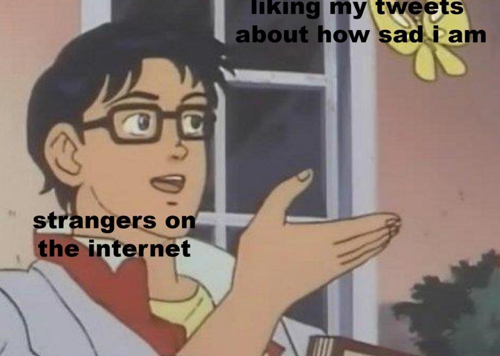
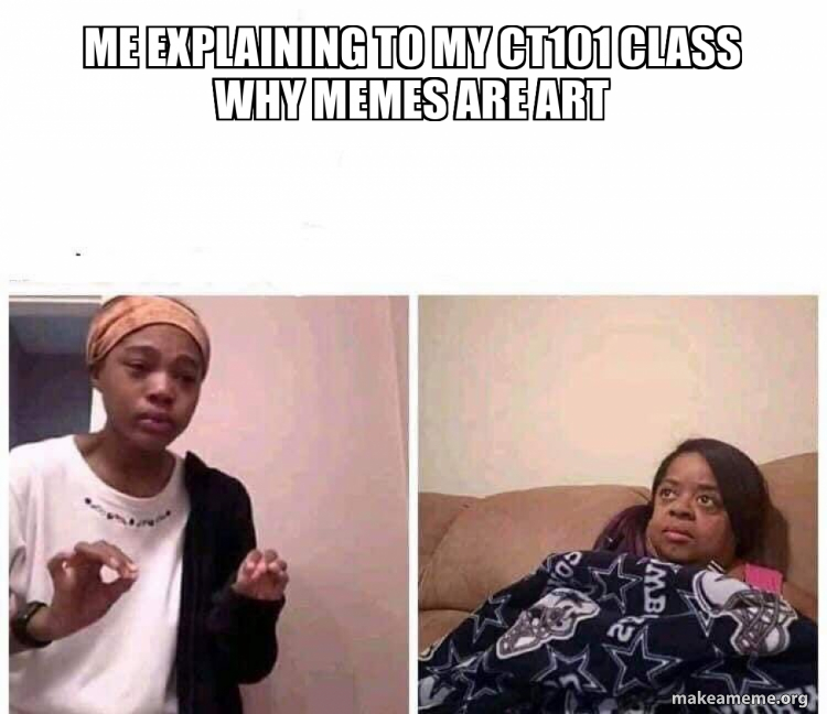
Looking back at my assignment posts, it’s clear how much I’ve developed my own blogging style. Assignment 1 and 2 were really where I was starting to get comfortable using it and embedding things into my posts. Assignment 3 was where we were able to create our own memes, so I learned how to do that using Make a Meme. Assignment 4 taught me how to make my own gif on Giphy. My post provided a step-by-step on how I did that.
Assignment 5 was one of the most intimidating. It gave us a lot of creative space to make whatever we wanted. Because it was such a big page and had so many different tools, it seemed like there was a lot to explore. But it also starts off as a blank canvas and you don’t exactly know where to start. Nonetheless, it was fun to create. Assignment 6 was the mid-semester assessment post, in which I reflected similarly on previous posts and evaluated my position in the class.
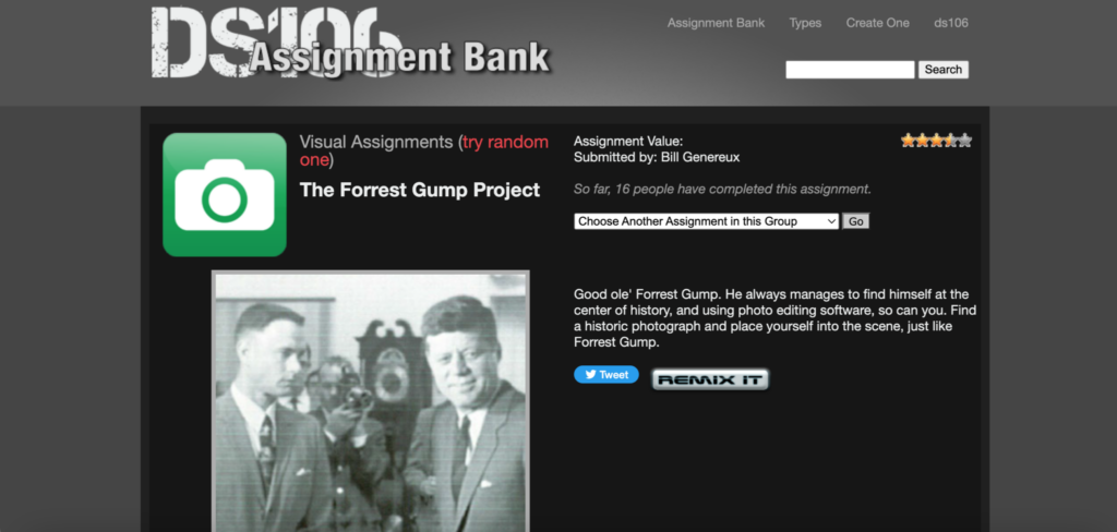
Assignment 7 was where we began discussing our websites and sparking ideas for domains. Assignments that followed, 8,9,10, all included the actual design process of our websites and were some of the more difficult ones for me. Trying to figure out how to design my website and doing research on hacks or tips for how to create it. And lastly, assignment 12, we got to explore our classmates’ websites, gave our critiques, gained inspiration, and evaluated each other.
Overall, this class was a great experience and I hope to carry out everything I learned in the future. If I were to grade myself in the class, I’d give myself either a B- or B. I think there were things I could’ve done better. More participation, more creative blog posts, etc. I am, however, still proud of the work I’ve done.
Final Website Tour and Description:
My home page is an introduction to me and a sneak peek at what to expect. I added in some personal details, along with a photo of myself.


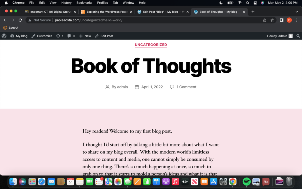
My blog page premieres my first blog post on my site. I thought I’d give readers a bit more detail on my plans for the site; what I’ll talk about or share and the sort of content they can look out for in the future. A deeper explanation.

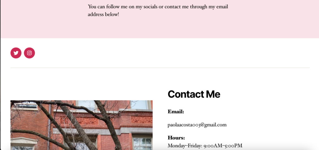
My contact page includes my socials: Instagram and Twitter, as well as my email and what hours fit best for my schedule.
It’s been a frustration trying to figure out how to make my website more attention-grabbing and fun. But, I will say it was fun trying something I’ve never done before and I hope to continue building it moving forward.
Thanks class.


